Understand Site Overview 📊
A Site in Hello Clever represents a specific location or platform where you accept payments. It can be an e-commerce store, a physical location, or any other integrated system where you use Hello Clever services.
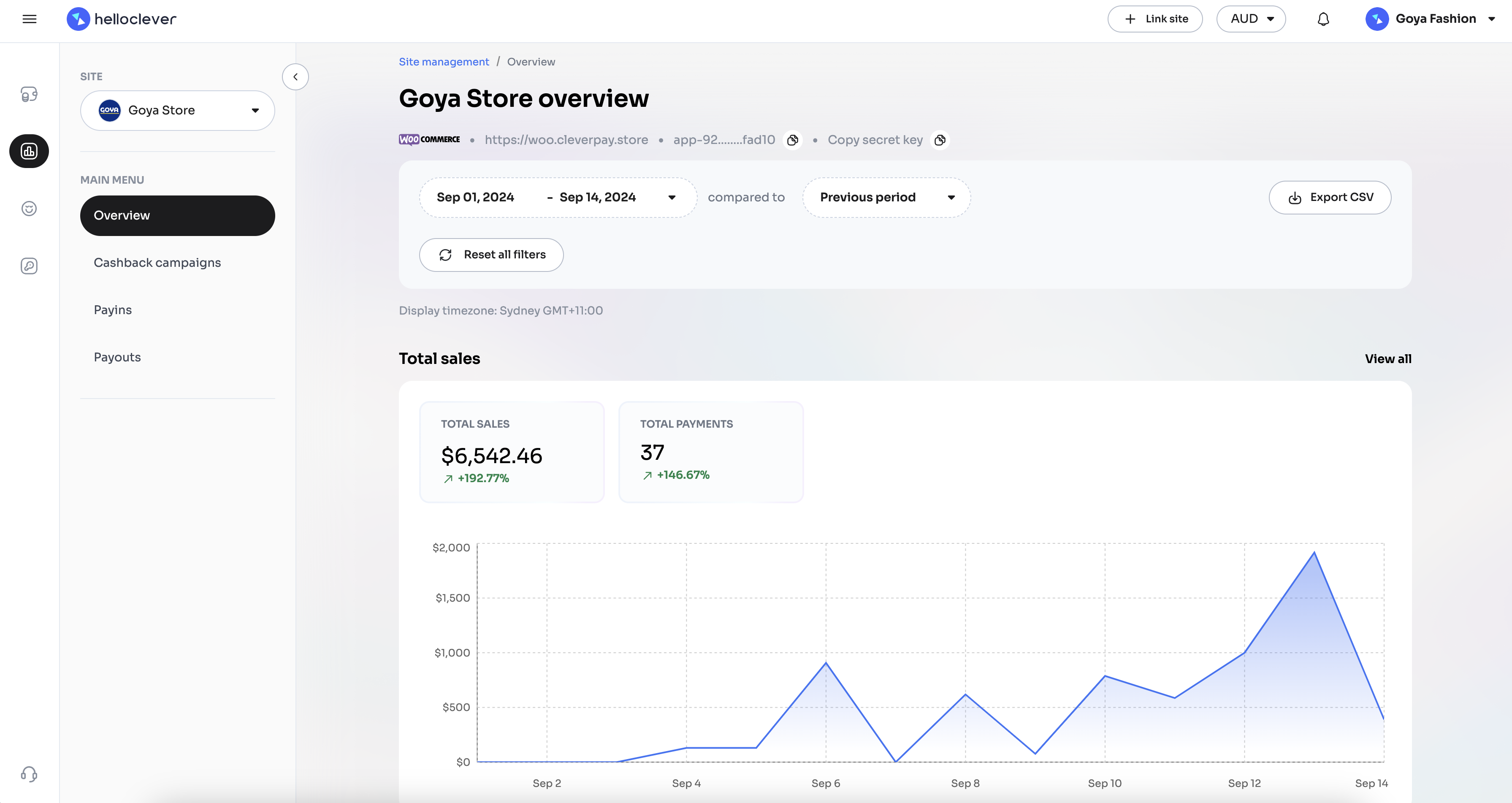
Overview Screen
On the Overview screen for each site, you'll find key insights and data visualisations that provide a deeper understanding of your site's performance:
-
Total Sales: Shows the total sales for the selected period, with a chart that allows you to track revenue trends over time. Spikes and dips in this chart can indicate changes in customer demand, seasonality, or the impact of promotions.
-
Total Payments: Displays the total number of payments processed. Monitoring this helps identify patterns in transaction volume, enabling you to gauge customer activity and pinpoint peak transaction times.
-
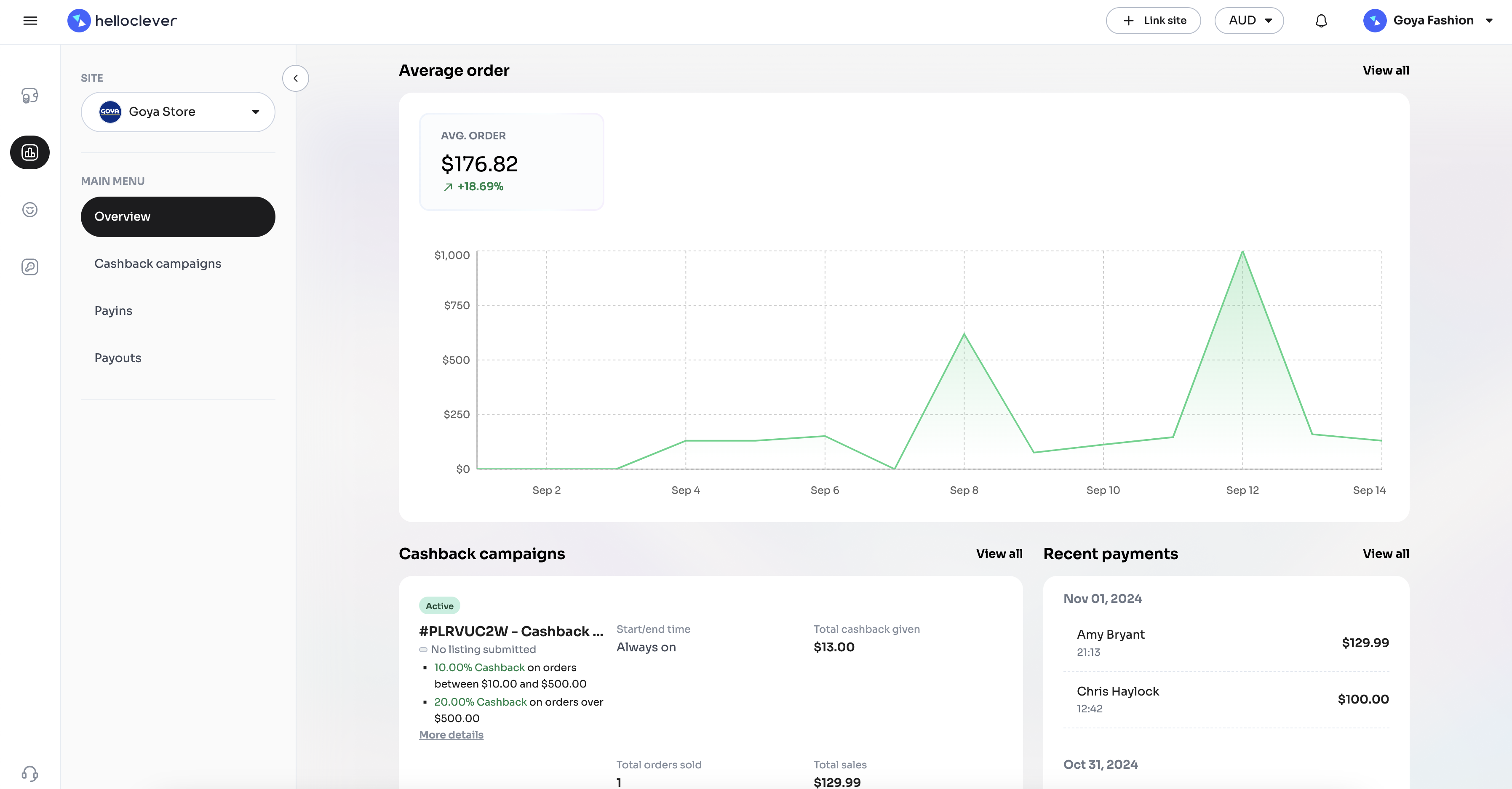
Average Order Value: Shows the average transaction amount, with a chart reflecting the changes in order value over time. This metric helps you understand customer spending patterns and can guide pricing strategies or promotions aimed at increasing order sizes.
-
Cashback Campaigns: Displays information about active cashback campaigns, helping you see their direct effect on sales. If a campaign is performing well, it may be reflected in increased sales volume or higher average order values.
-
Recent Payments: Lists recent transactions with details like date, customer name, and amount. Reviewing recent payments gives you a snapshot of your most recent customer activity, helping you keep track of transaction flow and customer engagement.
Each chart on the Overview screen provides actionable insights, enabling you to make data-driven decisions to optimise performance, tailor promotions, and improve customer experience.
Comparing Periods 📊
In the Overview screen, you can see a comparison of your site’s performance metrics between two consecutive time periods. By selecting a period (e.g., "Sep 1, 2024 - Sep 14, 2024") and choosing compared to Previous Period, the system will calculate and display the percentage change in key metrics like Total Sales and Total Payments.
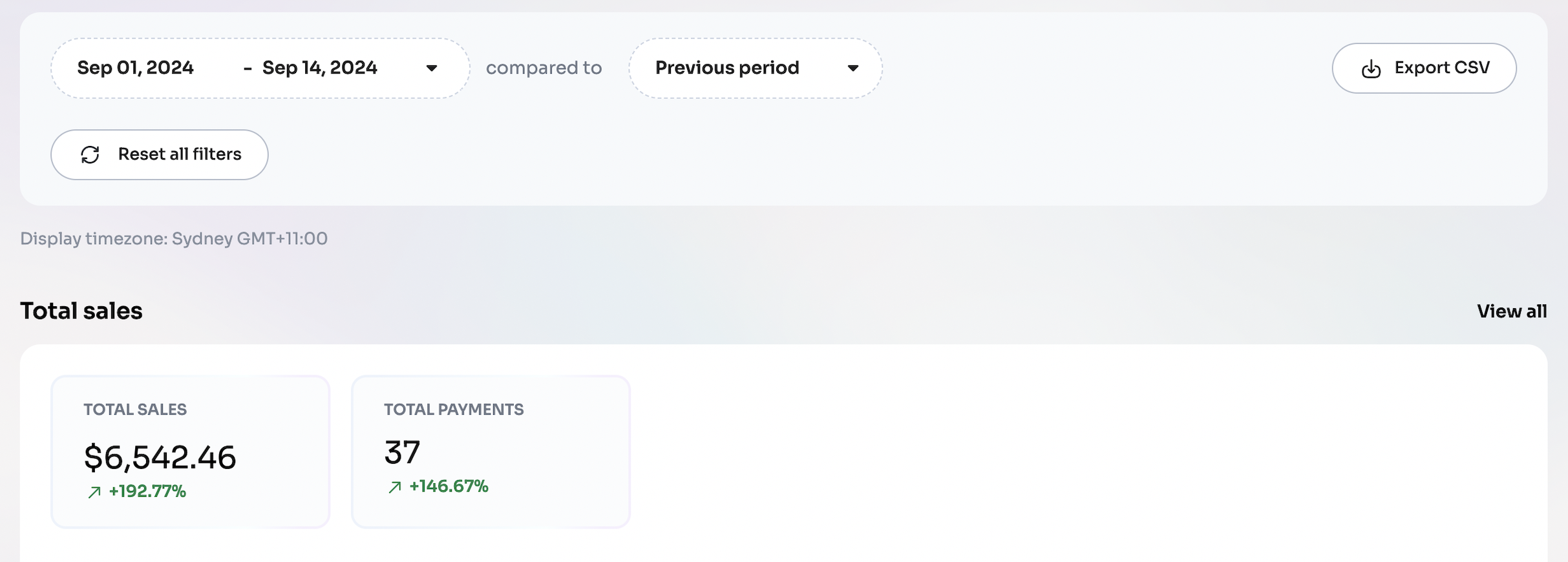
This comparison allows you to see how your site’s performance has changed over time. For example, if the Total Sales metric shows +192.77%, this means that sales increased by 192.77% compared to the immediate previous period of the same length of time. Similarly, if Total Payments shows +146.67%, it indicates an increase of 146.67% in the number of payments made compared to the previous timeframe.
These percentage changes are valuable for understanding growth trends and evaluating the impact of campaigns, promotions, or other changes you might have implemented. Positive percentages represent an increase, while negative percentages (e.g., -15%) would indicate a decrease compared to the previous period.